Developing from a local society to an international online society, EYES needs to maintain certain values while promoting others. I proposed a plan of action, which I called “The Stratagem” and included the following:
1. Positioning as a brand
2. New Naming
3. Re-structure web-page, and communication strategy
4. New Branding to help possibilitate growth.
5. Application of new branding across all mediums
Thursday, June 14, 2007
The New Logo

Tuesday, June 5, 2007


Sunday, June 3, 2007

Tuesday, May 29, 2007
4Proposals
 I have almost made up my mind, but I'd reaaally appreciate it if you could tell me which one (at first glance) seems the most appropriate for you. Thanx!


Monday, May 28, 2007


Sunday, May 27, 2007
Set Backs..
 I read this book at the beginning
 of the year, and since then i've referenced back to it quite alot,
it is so full of truths!
A must for all designers..!
Specially relevant the chapter on clients, "How to spot a time waster."
Saturday, May 26, 2007


Thursday, May 24, 2007
Imagery for the spirit of the Project
 Imagery has to comply with the values behind the society, evoking inspiration. Portraying people that have excelled, thought out of the box and persued their dreams. The images have to appeal to our sense of adventurism, the eternal interest for the farther away; flying and the first reaching to the moon are great examples of all this. These layouts are to be revised, and an incorporation of a quote, on the subject of entrpreneurs or leaders, is going to accompany the image.

Tuesday, May 22, 2007
Snail Logo
 Snails logo comes from the idea that the circle in the middle is an EYES member. That member is enveloped by EYES and the 3 swoosh's are the 3principal values behind the society: inspire, create, excel. The symbol also has hidden the form of the world and the swooshes make the world turn. However the most obvious of its similarities with the brand is the use of the low cap 'e' which represents 'emerging' 'entrepreneurs' which is really all the society is about. Keeping the 'e' low cap wants to imply these are young people involved.
 I can see this one moving on the web and interacting with all types of images, so I guess though it's not finished and hasn't been approved, in my opinion, here we have a winner!!
Monday, May 21, 2007
Umbrella Variations

 The story behind this logo fits perfectly with the society. The use of low caps is intentional to relate to young people. The umbrella is the society which acts as such for them towards the outside business world, and the society has a strictly "clicking" policy when admitting new candidates, so the almost merging of the two ee's works in that dimension. Colour-wise, keeping the green, but playing around with non-flat colours to maintain a 3d feel. It may not be the definitive, but it's almost there.... Only problem with this one is that it has a static feel to it. That might change though... and I still have another one in the hat which could work.


Saturday, May 19, 2007
Brand Analysis (part of book that goes at the end)

I have problems naming... i'm trying to give the parts a nice title so people will be more inclined to read it. However with this first part it's quite difficult. It's the boring part of investigating the brand in its environment, identifying strengths and weaknesses, and how it stands as opposed to similar ones. Where the game starts, with the Branding, I intend to use a story-telling methodology.

Working on Branding

I'm still working on branding, and at the same on gathering together all the parts to my project. These are crops of the last sketches I've done, computer versions are on their way.
Friday, May 18, 2007
Translation to the Post Underneath
"This this the logo that I had done previous to the one underneath, and I wasn't happy with it. It runs along the lines of what you wanted (refering to the client)... what you want is a coca cola brand and your brand is not equiped to support that. I propose something much simpler, yet wittier. No floweries, no crazy animations. Visual game, with an enduring visual impact. The logo underneathb (refering to the one underneath the one just below) is not finished and it has a long way to go, but its the start of something that can last."
--------------------------------------------------------------------------------
I have to add that he ended up giving me the benefit of the doubt. He doesn't want me to leave him out of the progress and understood this is my fmp. He has given me alot of his time; giving me all the necessary things to complete this project accordingly.
Tuesday, May 15, 2007
The Brand II
 Es el logo que habia hecho previo al de debajo, y no me quedé nada contenta. Seguia por la linea de lo que habiamos hablado... tu lo que quieres es una marca coca cola y tu marca no esta preparada para sostenerlo. Yo propongo algo mas sencillo pero a la vez mas intelligente. Para la vista entrenada. Nada de floriponcios ni animaciones raras. Juego visual, a la antigua si quieres, pero mucho mas duradera para cualquier vista. El logo de debajo no esta acabado y le queda bastante, pero es el comienzo de algo que puede perdurar.
Monday, May 14, 2007
The Brand
 What the logo has to evoke:
 1. Young, Ambitious future Leaders
2. Platform for Interaction & Umbrella towards the outside world.
3. Members that Click (soc. for like-minded/spirited people).
Sunday, May 13, 2007


Saturday, May 12, 2007
2hrs // 3 People Conference Call
Two things very useful from the call: they are using in their logo a licenced typeface which they are not paying for, and people often go up to them to ask them about their 'green' environmentalist group.
Friday, May 11, 2007
The Issue of Complexity
 With 3weeks to go this project only seems to go uphill, yesterday's meeting complicated things for me just A BIT more....
Thursday, May 10, 2007
And the Winners Are....
 after popular acclamation LOGOS + DESCRIPTION OF REASONING + NUMBERING, so any comments can be addressed accordingly.
Wednesday, May 9, 2007
Winners Go on to > the Next Stage
 Its nice to be feeling like a designer again... I was starting to get worried with the lack of creativity in this project. I have two problems in mind: illustrating INSPIRE, CREATE, EXCEL. And transmitting in the logo that this society is about ambitious, intelligent, leaders, without loosing the HUMAN factor in it. Meeting this noon...
Big Day Tomorrow... 1st Meeting with EYES
Up until now it's all been over the phone and on internet (a few comments on the blog, and emails). I'm not sure what I should start with. He is arriving 11'ish and meeting's 12noon: Liverpool St.
On Friday we're having a conference call to discuss QUESTIONS aroused, with the IT manager (person in charge of all WEB issues in the society) and maybe also the General Director of EYES... (scaryyy)
I think the best way to proceed is to have the schematic representation of my ideas, in a diagramatic way with straight forward statements of what I want to change & taster of logo's paths that have been created. By now I know my reasoning by memory so it shouldn't be difficult to back up any decisions.
With feedback, I will be better capable of moving forwards.
Tuesday, May 8, 2007
Dreary Start
 Its a dreary start but I need to get a clear view of what elements are going to go on each page to proceed on creating a template that can work throughout. This is only the page in WEB1, or guests web. With the template, I want to integrate very smooth animations that will make the page much more dynamic.
I am using similar templates in guests&members WEBS, but the design in the members pages will evoke a warmer feeling of belonging. I want to have a strong grid behind all that is done because it's what will give consistency in the pages with alot of information. This grid hopefully will work in all print work too.
I have to decide on a type to use in the web page and all the print applications (powerpoint, word, etc.). This (or these) type has to be free and easily accessed for any computer, whilst working well on screen and type.
By the end of this week I intend on having quite a lot decided and done. Time is really running!!!!!!!!
Statistics!!

Just as I thought things couldn't get more complicated I received a bunch of statics for the current web-page. I have actually been waiting for these for some time now because its the only thing missing for me to really understand how the web page is used. But these graphs are difficult to understand and there are many I'm not sure what they're for.
Others have been very useful; depth of visits (how long a person spend on the page); top exit points!!(where they might get bored...); connection speed (incase I was thinking about doing an over heavy flash presentation); visitor recency; visitor loyalty... even a map from where people connect.
In between the networks used, was The London Institute!! Thats me/us!! I'm probably all of the high points for these statistics in the past month...
I have also realized this is going to be a great way of proving if my changes make a difference. I'll have to go back towards the end of this year, say december, and print out the new statistics.
Thursday, May 3, 2007
WEB BASICS
 General decison making, which is being further developed to represent specific development objectives. At this stage client input is essential and they haven't gotten back to me with the statistics of the current web page!!!! But I'm not posting eye candy till decisions are taken.

Thursday, April 26, 2007
Final Outcome
EYES needs a Style or Brand Book, explaining all the uses of the indentity for the brand. However for them it is most useful just to have a pdf style presentation in a digital format and I'm not happy with that being the final outcome for my FMP.
So... I have decided I want to do an extended longer version of a Brand Book which I am going to call "EYES Stratagem" and where all the parts of the project are going to be recollected. In a brand book the changes would not be explained, and I doubt I should go into details of what I changed... I'm a bit stuck... don't want to go into writing a diary of EYES makeover, but I would like to explain my reasoning behind for example the use of certain animation in the web page, or the programation needed to get the notice boards to change, or where those notice boards should go in the web.
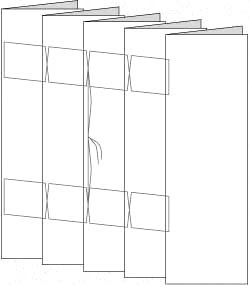
I have still to write out the exact chapters to the book but I'm going to have a similar problem with that of the creamfields book, there are various sections to the branding, and for the book to be functional (in an ideal world where the client would use it physically) the different sections should be able to be taken apart.
Thursday, April 19, 2007


Subscribe to:
Comments (Atom)